
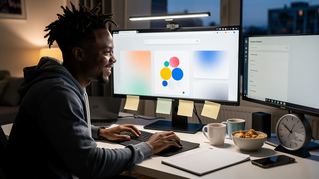
I opened a URL on a Tuesday afternoon looking for the answer to a work question. Twenty minutes later I had not typed a single search query. I had instead spent the entire window tossing pieces of the Google homepage around like loose change. I came out the other side with my question still unanswered, a half-built pile at the bottom of the viewport, and zero regrets. That is the spirit of this post. There is a piece of the modern web that still behaves like it was built for fun, and most people who use Google every day have never seen it.
What it actually does, and what it is not
There is a near-clone of the Google homepage that loads in half a second, looks identical for the first frame, and then the entire layout gives up on its job. Nothing crashes. No dialog pops. The page just starts behaving like a pile of loose parts sitting on a slope. Some pieces are heavy. Some are light. The whole thing slides, and you can grab anything once it has settled.
It is the most honest kind of software Easter egg (a hidden feature buried inside a normal product) because it does not need any permission, any extension, any account. You load the URL, you wait one beat, and the page reorganizes itself in front of whoever happens to be sitting next to you. I have shown it to people who build search engines for a living. They still laugh. The reaction is the part that makes the trick work.
- The page is a small JavaScript toy on top of an ordinary web page.
- Your account, your cookies, your saved searches stay exactly as they were.
- Refresh and the regular Google comes back, slightly disappointing.
- Works on any modern browser, no install needed.
That is the part nobody talks about when they dismiss the modern web as a finished place. The web is not finished. The web is mostly bored. A small page that does one weird thing on purpose is the cleanest counter-argument I have found.
The part most people miss
The first ten seconds are a hook, but the toy starts being fun once the dust has settled. Every piece is still alive on the page after it lands. You can grab any of them with the cursor. You can throw one into another. Two runs of the same trick almost never end up with the same pile. That is what turns the page from a clip into something you actually play with.
A few small details that make it land differently:
- Heavy pieces settle first.
- Lighter pieces keep rolling around for a long time after the big ones have stopped.
- You can knock a piece out of the pile by throwing another piece at it.
- The page does not record anything. Nothing saves. Nothing syncs.
This is also why the search results for related queries tend to surface video clips of other people playing with the page. The clips are fine. The version that earns the name is the one where you are the one throwing the pieces.
A small tradition from an era when this was normal
The whole family of Google tricks comes from the same era of the web, when shipping a hidden toy inside a product was normal practice. The spirit was simple. Build something nobody asked for. Do not promote it. Do not sell it. Let people find it. Half a dozen of them still work today.
The list changes shape depending on who you ask, but the canon I have on hand looks roughly like this:
- One floats the whole layout upward instead of letting it fall.
- One collapses the page sideways into a single point that disappears.
- One wipes half the visible elements and leaves the rest standing.
- One tilts the page a few degrees without dropping anything.
- One flips the page on its vertical axis without any motion at all.
Each one is a half-minute distraction. Together they are a clearer argument for keeping a browser tab open than most productivity tools I have tested this year. None of them take any setup. None of them save any state. None of them want anything from you.
What it taught me about my own attention
The reason I keep coming back to this trick is that it interrupts the modern web in a way almost nothing else does. Most software today asks you to do something. This page asks you to do nothing, and somehow that is more interesting than half the productivity apps I have tried. There is no onboarding flow. There is no tour. There is no upgrade prompt. There is a page, and then the page gives up on being a page, and then you decide what to do next.
That is a tradition I wish more products remembered. Not every interaction needs a goal. Not every page needs a CTA (a call-to-action, the button that tells you what to do next). Some of the best pieces of software are the ones that respect your attention enough to ask for none of it. The twenty minutes I lost to this trick are twenty minutes I would have spent refreshing the same three tabs anyway.
Trade-offs
The trick is not free. It runs JavaScript on every animation frame, which means an older phone with a crowded frame will warm up faster than you expect. The page also works best on a desktop browser, where dragging with a mouse or trackpad feels natural. On a phone you get one finger, and you do not get the precision to make a thrown piece land somewhere specific. Pinch zoom still works, which is helpful, but the throw physics feel coarse compared to a desktop cursor with three buttons of pressure nuance.
Privacy is not a real trade-off, but people ask, so I will say it plainly. The toy does not change a setting, does not sign you into anything, and does not talk to the real search engine. Your account, your cookies, and your saved searches are exactly what they were before you loaded it. The page is not setting a cookie of its own. The page is not running a session. The page is barely running a server.
It also has no replay value past the first five minutes, in the sense that you will not discover anything new after that. The joy is in showing it to someone who has not seen it. After both of you have stopped laughing, refresh and go back to work. That last part is the only thing about the trick I do not love, and it is also the only thing that keeps it from being a productivity sink rather than a feature.
Bottom line
Open it on a laptop first. Drag something. Throw something. Then open it on a phone to feel how much harder it is to be playful with one finger. If the default drop looks too tidy, switch to a bouncier mode. If Bouncy looks too chaotic, switch to the no-gravity mode. Refresh when you are ready to be a serious person again. Twenty minutes is the realistic budget. Plan accordingly.