
There is a moment when you finish a chapter on a screen and your brain does not register that anything finished. You tap, the words change, the chapter number ticks up, and yet the experience feels continuous. There is no weight to the boundary. That flatness is the part most people cannot name but everyone feels when they read long-form on a tablet.
A single toggle inside the Kindle app fixes most of it. The setting has been there for years. Most readers never find it because Amazon hid it three menus deep. Once you turn it on, the difference is immediate, and it changes how long you can read before your eyes drift.
Where the toggle lives and what it does
In the Kindle app on iOS or iPadOS, open any book. Tap the center of the page to bring up the reading chrome. Tap the Aa button at the top to open the display menu. Inside that menu is a row labelled More. Tap it, and the first option in the expanded list is Page Turn Animation. Flip it on.
The default in the app is off. There is a reason for that default, and the reason is that page turn animations are slightly slower than an instant cut. Amazon optimizes for the fastest possible page flip, which is what reference readers and skimmers want. Deep readers want the opposite, and they have to dig for it.
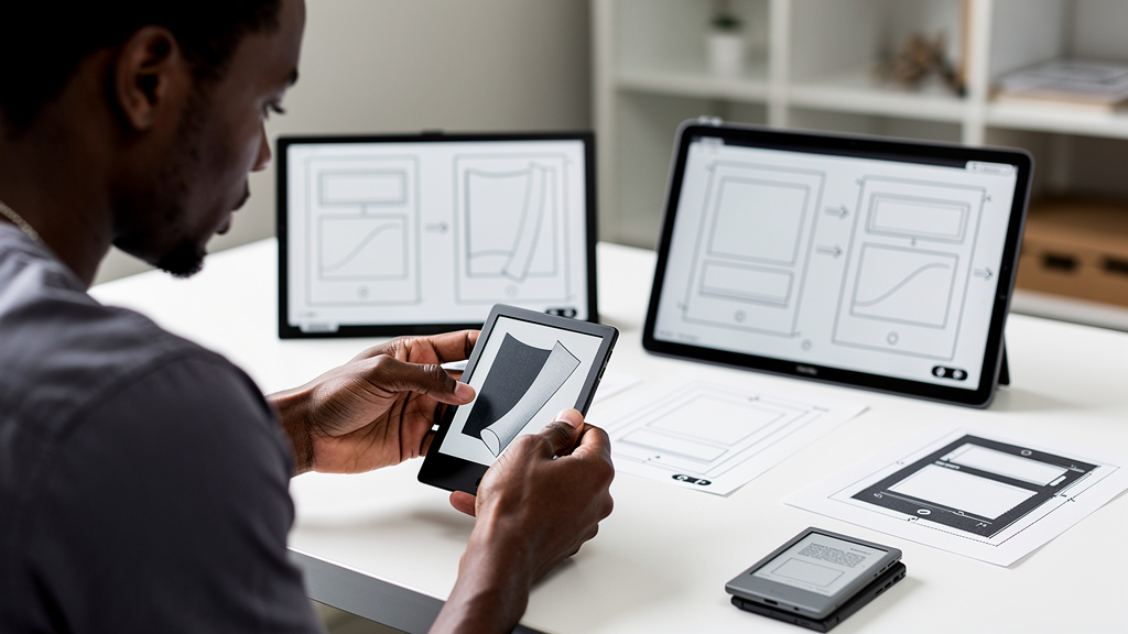
What the toggle changes is the transition between pages. Instead of the new page snapping in instantly, the old page slides out and the new page slides in with a gentle curl. The motion takes roughly a third of a second. It feels slow the first time you try it. It feels right after about a hundred pages.
A quick checklist for finding it:
- Open any book in your Kindle library
- Tap the center of the page to bring up the menu bar
- Tap the Aa button at the top of the screen
- Scroll the menu that appears and tap More
- Toggle Page Turn Animation on
- Tap outside the menu to dismiss and start reading
Why motion matters more than you would expect
The reason paper books still feel different from tablets is not the screen, the lighting, or the smell. It is the boundary. A page turn is a small ritual. Your hands do something, your eyes do something, and your brain registers a moment of completion before the next moment of consumption begins. That micro-pause is what gives a book its rhythm.
When you scroll a webpage or a PDF, no such boundary exists. Content just keeps arriving. Your brain does not flag transitions, so it cannot anchor itself to a position. After an hour of scrolling, you have read three articles and remember none of them. After an hour of flipping pages, you have read forty pages of one book and remember most of them.
The page turn animation recreates the missing boundary on a tablet. It is not skeuomorphism for its own sake, which is what most digital-era design commentary would have you believe. It is a load-bearing piece of the reading experience, and removing it makes long sessions feel shallower.
The settings that quietly disable it
The Kindle app has two features that silently cancel out the page turn animation, and the app will not warn you when they are on:
- Continuous Scrolling, which lives under Aa and then Layout, replaces the discrete page model with an endless scroll. When you turn it on, the page turn animation disappears because there are no discrete pages anymore.
- Dark Mode in the Kindle app, on iPad, dims the screen enough that the curl motion is hard to see. The animation is still playing, but it is so subtle that you might think the toggle is broken.
There is also a system-level issue: if your iPad or iPhone is in high-contrast mode or has reduce-motion enabled in the operating system’s accessibility settings, the Kindle app respects those settings and skips the animation. That is correct behavior, but it can confuse you into thinking the Kindle toggle is the one not working.
If you turn on Page Turn Animation and do not see a difference, check those three places first. The most common culprit is Continuous Scrolling, because it is the kind of feature people toggle on once and forget about.
When to leave it off
There are real reading contexts where the animation is the wrong call. The argument for keeping it off is not aesthetic, it is functional:
- For reference books, dictionaries, and PDF-heavy technical material, you are not reading linearly. You are hunting for a passage, jumping back, scanning a table. The added quarter-second per page adds up across a session and slows you down.
- For very fast readers who flip a page every two or three seconds, the motion becomes visual noise. The brain registers the transition on every flip and you lose flow.
- For accessibility users who already find animation distracting or uncomfortable, the system-level reduce-motion setting exists for a reason. Leave the Kindle toggle alone and let the OS handle it.
The toggle is also worth turning off if you read the same book on multiple devices. A page turn animation that feels right on an iPad can feel sluggish on an older iPhone, and the inconsistency is its own kind of friction.
What it is worth, briefly
The whole feature is free, takes about ten seconds to enable, and either improves your reading or does not. There is no penalty for trying it and turning it off later. There is no subscription tier that unlocks it. It is the kind of buried setting that exists because someone on the Kindle team cared enough to ship it, and most users will never find it without being told.
If you read on an iPad or iPhone for more than thirty minutes at a stretch, the page turn animation is worth the ten seconds it takes to find. If you only read in five-minute bursts while waiting in line, the toggle is irrelevant. Match the setting to how you actually read, not to how you think you should read.
Trade-offs
The honest case against the page turn animation is that it makes the app slightly slower. On an iPad Pro that difference is invisible. On an older iPad or an iPhone from a few generations back, the lag is noticeable enough to feel like a bug if you are not expecting it. If your device is already at the edge of its performance, leave the toggle off and save the cycles for the words on the page.
There is also a case to be made that the whole page metaphor is outdated. Web reading, scrolling, infinite feeds: those are the dominant text-consumption patterns now, and the Kindle app is one of the last places where pages still mean anything. If you primarily consume text through articles and feeds, training yourself back into a page-based reading rhythm might not be what you want. The toggle is a vote for the older model, and the older model is not for everyone.
The third thing nobody mentions is that the page turn animation, once you get used to it, can feel wrong in a different way. Returning to a book app without it feels broken, the same way that returning to a TV with motion smoothing off feels weird. You have acclimated to a frame of reference that does not match the rest of your digital life. That is a small cost, but it is real, and worth knowing before you turn the toggle on.
For most iPad readers, the page turn animation is the single biggest reading-experience improvement available without spending money. If you have not tried it, the cost is ten seconds and a few pages. The upside is the difference between reading on a screen and reading in a book.