
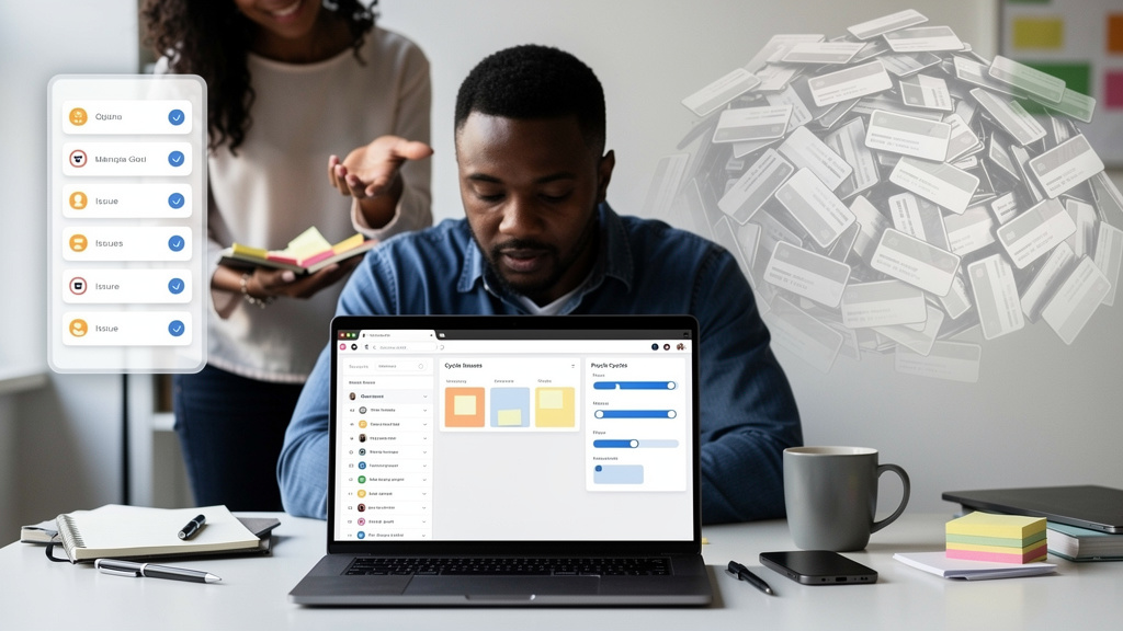
A column, a row, a button on a kanban board. The instruments do not sound interesting until you add up how many people across how many teams spend a working week a month rebuilding the same ones. Personal calendars that match a single role, release notes boards that match one team’s voice, weekly review checklists tuned to one manager’s questions, partner-handoff templates that match one customer’s intake process. None of these are software products. All of them are tiny internal tools, and almost all of them live in the only place they could live before something cheaper came along: a spreadsheet, a Notion page, a Slack thread, or someone rebuilding the same view in Linear for the third time this quarter.
The GitHub Copilot app’s canvases feature just made those tools one sentence long. “Describe what you want, and the interface shows up.” I want to walk through what actually goes away when that sentence is good enough, because the most interesting effect is not on the screens themselves. It is on what stops occupying a senior engineer’s Tuesday afternoon.
What used to require a designer
A custom internal tool that fits a single team’s actual workflow used to need three things: someone who could describe the workflow precisely, someone who could design a layout that matched that description, and someone who could ship a small frontend that ran somewhere. The most expensive of the three was usually the layout, not the code. Designers are paid to make screens that look polished and feel right; spending that on a weekly review checklist that two engineers will look at for twenty minutes a week is almost a category error.
Canvases lower the cost of the layout step to nearly zero, but the part that interests me is what survives once that is true. The work that used to justify the design review, which is to say, saying precisely what the screen is for, naming the controls, deciding what state the user can change, now has to be done by the person asking for the screen. They cannot hand it off to a designer who will translate “I want to see X but sorted by Y” into a wireframe. They have to write the wireframe themselves, in plain English.
That is a feature, not a bug, and most teams underweight how much it matters. Tools that are built from vague requests end up filled with controls that look reasonable and never get used. Tools that are built from precise descriptions end up filled with controls someone cared enough to ask for. The rename is not “designers out, prompts in.” It is “design decisions forced back onto the person who knows the work.”
What “bidirectional state” actually changes
The second piece of the canvas story is the part that matters more than the auto-generated UI, and most write-ups bury it: when you and the agent both write to the same state, the screen stops being a snapshot of the work and starts being a workspace for the work.
In a normal chat interaction, you ask the agent a question, the agent produces output, the screen displays it. Every “now update that record” request is a new round trip, the agent reads its memory of the prior turn, and the screen drifts behind the work. Canvases flip that. You can ask the agent to move a card or update a field, and the shared state updates live. You can move the card yourself, and the agent sees it on the next action. The screen and the chat are two surfaces for the same state, not two separate tools that have to be reconciled.
The practical effect is small for trivial work and large for the work that used to fall apart because of the reconciliation cost. A weekly review that lives in a chat transcript used to need a separate doc to hold the state. A triage board used to need a sync step every time the agent touched it. Once that sync step is gone, the conversation keeps moving instead of stalling on “wait, what was the state again?”
What to write in the first prompt
The cost of a vague canvas is several rounds of revision; the cost of a precise one is usually one. After a few canvas builds the pattern that works best is to answer three questions up front:
- What workflow does this canvas support (the verb it serves, not the noun it shows)?
- What should the human be able to do in the interface (move a card, edit a field, mark a step done)?
- What should the agent be able to do (add rows, fill columns, reorder items, attach notes)?
Most teams skip the third question because they assume the agent should be able to do whatever they can do. In practice the agent’s allowed actions are where most of the value comes from, and it is the part the human forgets to specify. A canvas that lets the agent attach a note to every card carries the project’s institutional memory. A canvas that only lets it read the cards carries nothing.
Where it does not earn its keep
For solo work (a personal calendar, a one-person weekly review, a private checklist), the canvas format pays for itself in minutes. For anything that has to be shared with people who do not use the GitHub Copilot app, the format is the wrong tool. The screen stays inside the workspace, and that boundary is not negotiable for any team that has customers, partners, or contractors who need to see the work. Reach for a canvas when the audience is “the people on this team.” Reach for something else when the audience is wider than that.
The other failure mode is the one where a canvas becomes the canonical tool by accident. Because it is so cheap to spin up, a team will build a canvas for triage, then another for a different triage, then a third because nobody remembered the second. Six weeks in, the work lives in two competing canvases and a spreadsheet, and the cost of consolidating is bigger than the savings from creating. Naming and storing canvases aggressively, and being honest about retiring the ones nobody opened in the last month, is the only fix I know of.
Trade-offs
The pattern is real, the cost savings are real, and pretending otherwise would be dishonest. The shape of the trade is also worth naming up front.
- Workspaces matter more than they look. The screen and the chat live inside one product, which means adoption is gated on whether the audience uses the product. Fine for a team; wrong for a partner.
- Prompt quality is a capability, not a tax. The person who writes the first prompt is doing the design work, whether they think of it that way or not. Briefs first, demos later.
- No version control of the live screen. A canvas is a live artifact, not a checked-in file. Recovering from a teammate breaking a useful one means asking the agent to rebuild it from a description, which is not the same as rolling back a commit.
- Iteration is the workflow, not the failure mode. Most useful canvases go through three or four revisions before they earn their keep. Budget for that, and stop trying to one-shot the design.
For personal work and small-team planning, this is the lowest-effort path I have seen from a description to a tool you keep using. For shared work across organizations, the format is the wrong tool.
Coach’s note
Pick a workflow a senior engineer on your team is currently rebuilding every month. Ask them to spend an hour describing it precisely in plain English, then turn that into a canvas prompt. The exercise will tell you three things at once: whether your description skill is good enough to ship without a designer, which parts of the workflow are genuinely unique to your team, and which parts are generic enough to belong in a regular tool. The answers are usually obvious within an hour, and the cost of finding out is much lower than the cost of continuing to pay a designer to maintain something nobody is excited about.