
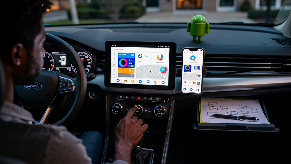
In-car software is the only major consumer software category that still ships on a quarterly cadence, and that is the cleanest framing for everything that just happened with Google’s phone-mirroring platform. The flashy keynote promised a wholesale rework. The build that actually arrived moves nothing visible. Anyone who has watched this category for more than a year is unsurprised, and the rest of us should probably recalibrate what “soon” means when a vendor is also selling to car companies.
The pattern is the same one we have seen play out with every previous infotainment refresh, and it deserves to be spelled out so the next round of demos can be watched with clearer eyes.
The structural reason car software slips
Phones are owned end-to-end by one vendor. The manufacturer writes the OS, ships the build, and pushes it to the user whenever it wants. Cars are not like that. Every change to a vehicle’s software stack has to pass through three different owners before it reaches a steering wheel, and each owner adds its own delay.
The first owner is the platform vendor, which in this case writes the underlying code and ships it to partners. The second is the automaker, which has to take that code, integrate it with the head unit, certify it against dozens of vehicle models, and decide when to flip it on for drivers. The third is the dealer network and customer support organization, which has to absorb the new behavior and answer questions about it. Every handoff between those three owners is a chance for the timeline to slip by weeks or months.
This is why the original headline of “Android Auto gets a major redesign” almost never matches what shows up on a dashboard in the same calendar year. It is not because Google is slow or because automakers are lazy. It is because the system has three independent release trains, and the slowest one always wins.
What the new build actually changes
If you read the changelog for the build that started rolling out this month, the most honest summary is that the visible user interface is identical to what shipped last quarter. The internal plumbing has been updated. The data layer that future features will build on has been laid down. The actual new design, the one with the floating controls, the home screen widgets, and the new voice layer, is present in the code base but not yet active for end users.
Reporting from 9to5Google on the underlying beta suggests that the new design elements are wired up but toggled off, which is a common pattern for staged rollouts that are common in any mature software category. The flip-the-switch moment will happen when enough automakers sign off on the integration. Until then, the visible dashboard remains the version that most drivers have already gotten used to.
That separation, between the plumbing being ready and the user-facing version being switched on, is the central thing to internalize. It is the reason “shipping” in this category means two very different things.
The piece of the redesign that matters most
Strip out the marketing, and the most interesting piece of the upcoming redesign is the smallest-sounding one. Glanceable home screen tiles, especially contacts, weather, and a smart-home control or two, would replace a meaningful fraction of the tap-to-navigate friction that drivers currently deal with. A contacts tile that lets you call someone in one tap is a real safety feature, because the alternative is tapping through a list while stopped at a light. A weather tile that you can read at a glance removes one reason to pick up the phone.
This is the genuinely load-bearing piece of the redesign, and it is also the piece most likely to face the longest certification delays, because every automaker has to decide whether the tile layout meets their internal safety review. The flashier pieces, like 3D buildings in the map view and the smoother full-screen takeover, are easier to certify because they are mostly visual. They look like more than they are. The tiles look like less than they are.
That inversion, where the smallest-looking change is the most useful one, is worth holding onto when the next keynote arrives.
Trade-offs
A few honest ones worth pinning down:
- In-car software will always ship slower than phone software, so any feature timeline should be mentally padded by at least one quarter.
- Glanceable tile layouts are the most useful and most delayed part of any car interface redesign, so do not judge the platform by its flashier demos.
- Connectivity in vehicles is genuinely uneven, so any cloud-dependent feature will be uneven too, especially the new voice layer.
- Older phones cannot run the latest in-car software regardless of which car you own, so budget for a phone upgrade if you are on a 2018 or older device.
If those trade-offs sound tolerable, the right move is to wait for the actual flip-the-switch moment and not the keynote that announces it.
What to actually do this month
If you want to be ready for the new dashboard when it actually ships:
- Verify your phone is running a current mobile OS version, since older builds will not get the new in-car features regardless of which car you drive.
- Pull the latest version of the mapping app you use from your phone’s app store, because the visual map improvements depend on the phone-side app and not the dashboard-side software.
- Look at your car manufacturer’s software-update page if it has one, so you know which trim levels and model years are scheduled for the new in-car interface.
- Decide which glanceable tiles would actually save you taps, because the layout you build when the feature arrives is the difference between a daily improvement and a missed opportunity.
- Stop refreshing your dashboard every morning and let the rollout come to you, because that has been the right move for every previous car-software cycle and will be the right move for this one too.
I want the new in-car software to land as much as anyone who has been waiting on it. I also know that the gap between a polished demo and a dashboard that actually shows the new design is measured in quarters, not weeks. Update your phone, update your apps, and let the rollout come to you. The day it arrives, you will not need to refresh anything to see it.
Why the keynote versus the build gap is good news for you
A two-track release cadence is frustrating when you are waiting for a feature, and it is quietly excellent when you are evaluating which platform to commit to. A platform with a long integration runway is a platform that gets more polished before it shows up on your dashboard, and a platform that respects automaker certification timelines is a platform that does not introduce surprise regressions into cars that cost forty thousand dollars.
Speed versus safety is the trade that has always existed in this category, and cars pick safety, which is the right call. Drivers pay for it with patience. Most tech-adjacent readers understand this in the abstract. Fewer of us internalize it when a flashy demo shows up on a stage and we expect to see the same thing in the driver’s seat by the end of the quarter.
Mental model worth carrying forward: the keynote tells you what the platform is becoming. The build that lands this month tells you what is currently true. Trust the second one.